Chart Widget Addons For Elementor

Modules
Active Users
Demo Sections
Variations
-
Line Chart
-
Column Chart
-
Pie Chart
-
Radialbar Chart
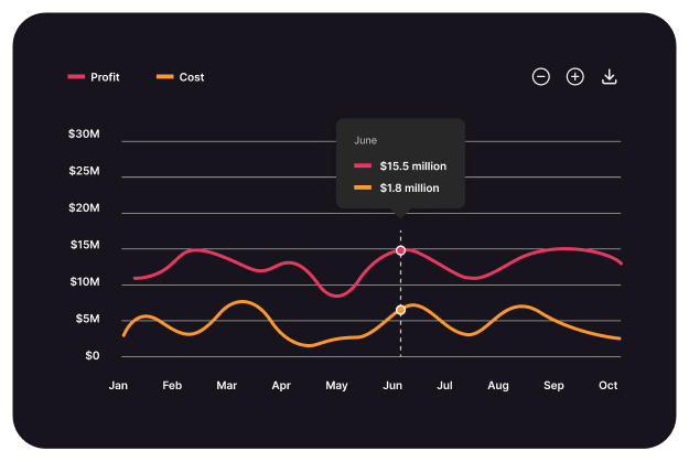
Line Chart
Combine multiple chart types in a Mixed Chart, offering a versatile way to compare diverse datasets in one visualization.
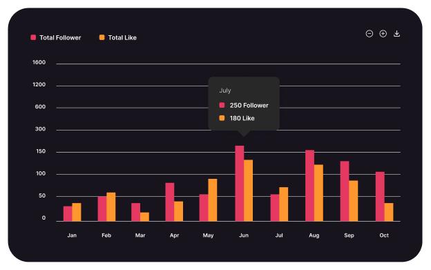
Column Chart
Display data comparisons easily with a Column Chart, highlighting differences between categories with clear, vertical bars.
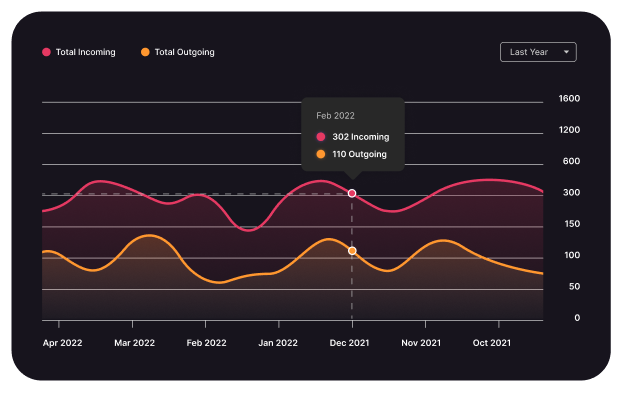
Area Chart
Visualize cumulative data trends over time with an Area Chart, emphasizing magnitude and changes through shaded regions.
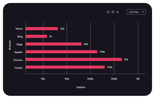
Bar Chart
Compare data across categories with a Bar Chart, using horizontal bars for clear visual distinctions and comparisons.
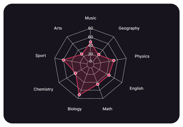
Radar Chart
Display multivariate data on a circular grid with a Radar Chart, comparing values across multiple dimensions effectively.
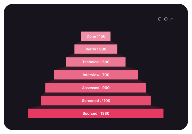
Funnel Chart
Visualize stages in a process with a Funnel Chart, highlighting drop-offs and conversion rates at each step.
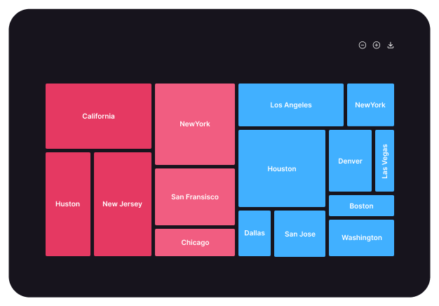
Treemap Chart
Display hierarchical data with a Treemap Chart, using nested rectangles to compare proportions and visualize data distribution.
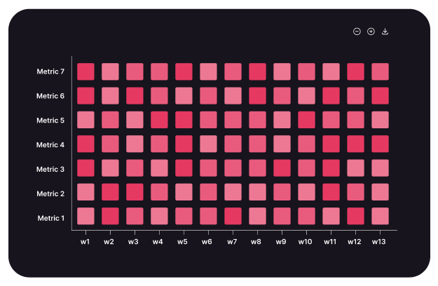
Heatmap Chart
Visualize data intensity with a Heatmap Chart, using color gradients to highlight patterns, correlations, and variations.
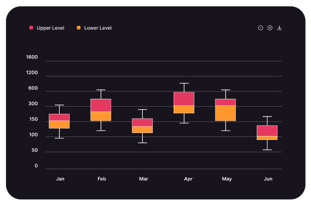
Boxplot Chart
Summarize data distribution with a Boxplot Chart, highlighting medians, quartiles, and outliers for effective statistical analysis.
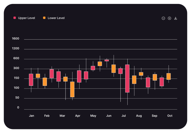
Candlestick Chart
Visualize price movements in financial markets with a Candlestick Chart, showing open, high, low, and close values effectively.
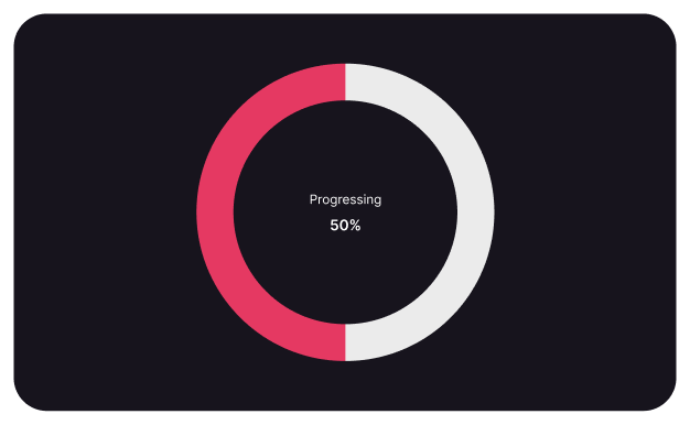
Radialbar Chart
Display data progress and performance with a Radial Bar Chart, using circular bars to illustrate completion percentages visually.
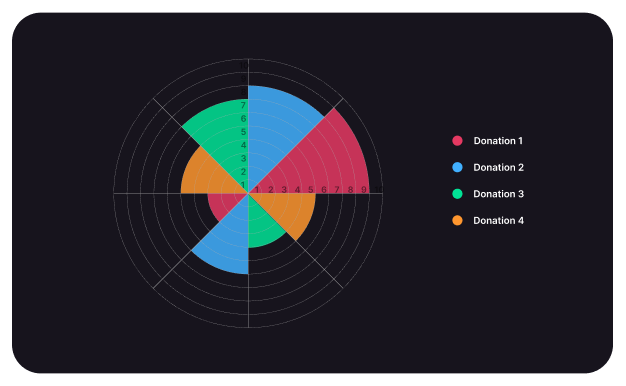
Polar Area Chart
Visualize data proportions in a circular format with a Polar Area Chart, highlighting differences through radial segments.
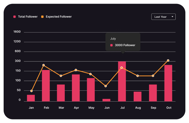
Mixed Chart
Combine multiple chart types in a Mixed Chart, offering a versatile way to compare diverse datasets in one visualization.
Line Chart
Visualize data trends and fluctuations over time with a Line Chart, offering a clear and smooth progression analysis.

Column Chart
Display data comparisons easily with a Column Chart, highlighting differences between categories with clear, vertical bars.
Area Chart
Visualize cumulative data trends over time with an Area Chart, emphasizing magnitude and changes through shaded regions.


Bar Chart
Compare data across categories with a Bar Chart, using horizontal bars for clear visual distinctions and comparisons.
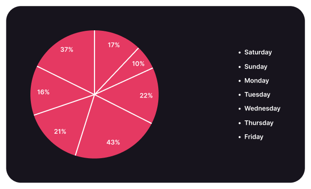
Pie Chart
Show data proportions in a Pie Chart, visually dividing a whole into slices representing percentage-based contributions.

Radar Chart
Display multivariate data on a circular grid with a Radar Chart, comparing values across multiple dimensions effectively.
Funnel Chart
Visualize stages in a process with a Funnel Chart, highlighting drop-offs and conversion rates at each step.


Treemap Chart
Display hierarchical data with a Treemap Chart, using nested rectangles to compare proportions and visualize data distribution.
Heatmap Chart
Visualize data intensity with a Heatmap Chart, using color gradients to highlight patterns, correlations, and variations.


Boxplot Chart
Summarize data distribution with a Boxplot Chart, highlighting medians, quartiles, and outliers for effective statistical analysis.
Candlestick Chart
Visualize price movements in financial markets with a Candlestick Chart, showing open, high, low, and close values effectively.


Radialbar Chart
Display data progress and performance with a Radial Bar Chart, using circular bars to illustrate completion percentages visually.
Polar Area Chart
Visualize data proportions in a circular format with a Polar Area Chart, highlighting differences
through radial segments.


Mixed Chart
Combine multiple chart types in a Mixed Chart,
offering a versatile way to compare diverse
datasets in one visualization.
Unique Chart Styles for Full Customization
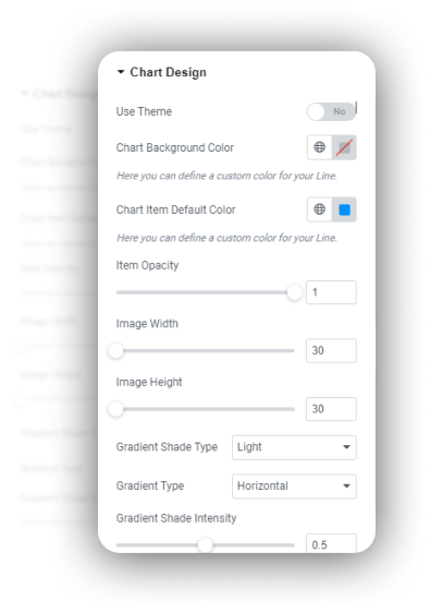
Chart Design
Using different data sources—whether custom, CSV, databases, APIs, or Google Sheets—provides flexibility in chart creation.
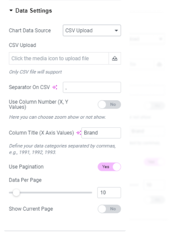
CSV Upload Type
Using CSV data to create charts is a common approach, especially when handling data from external sources.
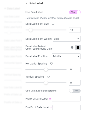
Data Label Settings
Configure and customize data labels to enhance chart clarity, improve readability, and represent key values effectively.
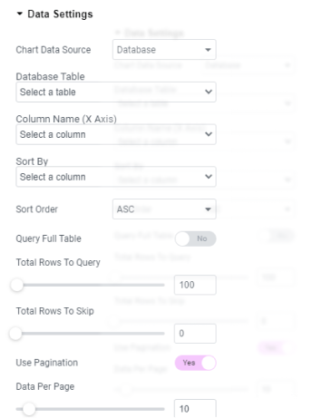
Database Options
Using Database Data Type to create a chart involves directly retrieving data from a database (such as MySQL, PostgreSQL, etc.)
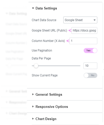
Google Sheet Settings
Using Google Sheets to create charts involves connecting your sheet data to external tools for visualization and analysis.
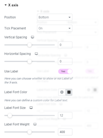
X-Axis Border Settings
Customize the X-axis border to enhance chart appearance, define limits, and improve readability for better data visualization.
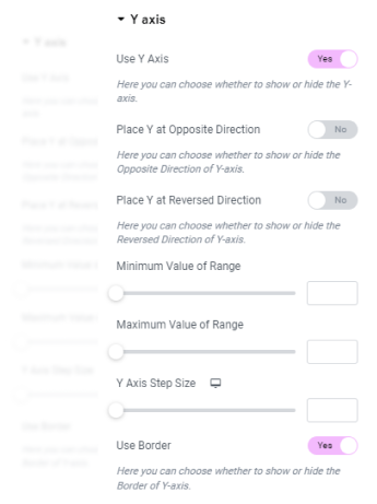
Y-Axis Border Settings
Customize the Y-axis border to define chart boundaries, improve data visibility, and enhance overall chart presentation.
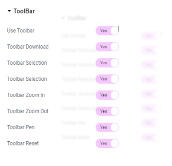
Toolbar Settings
Customize toolbar options to manage tool visibility, layout, and functionality for a more efficient user experience.
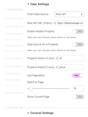
Rest API Settings
Configure REST API settings to manage endpoints, authentication, and data flow between applications for seamless integration.
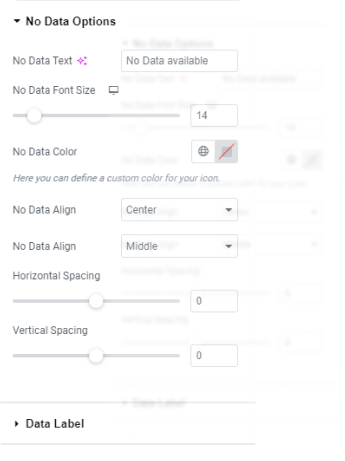
No Data Options
Configure settings to handle cases with no data, including placeholder text, default values, or visual indicators for better user experience.
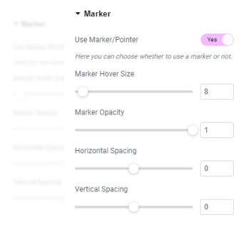
Marker Options
Customize marker styles, sizes, and colors to highlight specific data points for better chart visualization and clarity.
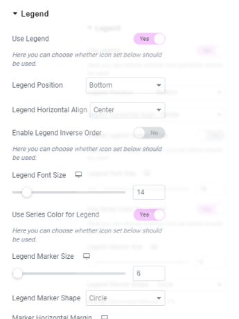
Legend Settings
Configure legend appearance, position, and behavior to enhance chart readability and clearly represent data series.

Chart Design
Using different data sources—whether custom, CSV, databases, APIs, or Google Sheets—provides flexibility in chart creation.
CSV Upload Type
Using CSV data to create charts is a common approach, especially when handling data from external sources.


Data Label Settings
Configure and customize data labels to enhance chart clarity, improve readability, and represent key values effectively.
Database Options
Using Database Data Type to create a chart involves directly retrieving data from a database (such as MySQL, PostgreSQL, etc.)


Google Sheet Settings
Using Google Sheets to create charts involves connecting your sheet data to external tools for visualization and analysis.
X-Axis Border Settings
Customize the X-axis border to enhance chart appearance, define limits, and improve readability for better data visualization.


Y-Axis Border Settings
Customize the Y-axis border to define chart boundaries, improve data visibility, and enhance overall chart presentation.
Toolbar Settings
Customize toolbar options to manage tool visibility, layout, and functionality for a more efficient user experience.


Rest API Settings
Configure REST API settings to manage endpoints, authentication, and data flow between applications for seamless integration.
No Data Options
Configure settings to handle cases with no data, including placeholder text, default values, or visual indicators for better user experience.


Marker Options
Customize marker styles, sizes, and colors to highlight specific data points for better chart visualization and clarity.
Legend Settings
Configure legend appearance, position, and behavior to enhance chart readability and clearly represent data series.

Elementor Chart FAQ
Elementor Chart is a WordPress plugin designed to integrate seamlessly with the Elementor Page Builder, enabling users to create and customize various types of charts and graphs for enhanced data visualization on their websites. Here are some frequently asked questions about the Elementor Chart plugin:
What is the Elementor Chart plugin?
The Elementor Chart plugin is an add-on for the Elementor Page Builder that allows users to effortlessly include animated, interactive graphs and charts on their WordPress websites. It supports various chart types, including line, bar, pie, doughnut, and radar charts.
Is Elementor Pro required to use the Elementor Chart plugin?
No, Elementor Pro is not mandatory. The Elementor Chart plugin is compatible with the free version of Elementor.
Can I use the Elementor Chart plugin with any WordPress theme?
Yes, the plugin works with any WordPress theme, provided that the Elementor Page Builder is installed and active.
How do I install the Elementor Chart plugin?
To get started, first purchase the plugin from the WPHOOP website. Once purchased, download the file from your My Account section. Then, install and activate the plugin. You can see Admin Menu name is “Elementor Chart”.
What types of charts can I create with the Elementor Chart plugin?
The plugin supports various chart types, including: 17 Charts are available here.
- Line Chart
- Column Chart
- Bar Chart
- Pie Chart
- Donut Chart
- Area Chart
- Radar Chart
- Funnel Chart
- Treemap Chart
- Heatmap Chart
- Boxplot Chart
- Candlestick Chart
- Radial Bar Chart
- Polar Area Chart
- Mixed Chart
- Scatter Chart
- Slope Chart
These options enable users to effectively visualize different data sets.
Can I customize the appearance of the charts?
Yes, the Elementor Chart plugin offers extensive customization options, allowing you to adjust colors, fonts, labels, and other styling elements to match your website’s design.
Is the Elementor Chart plugin responsive?
Yes, charts created with the Elementor Chart plugin are fully responsive and adapt to different screen sizes, ensuring optimal display on all devices.
Can I import data from external sources into the charts?
Some Elementor chart plugins offer the ability to import data from external sources like CSV files or Google Sheets. For instance, the Premium Charts Widget allows data import from CSV and Google Spreadsheets.
Save UP to 60% OFF Before
the Merry Christmas Sale End


