Chart Kit Module for Divi

Modules
Active Users
Demo Sections
Features
-
Line Chart
-
Column Chart
-
Pie Chart
-
Mixed Chart
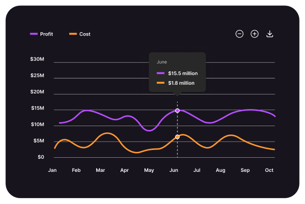
Line Chart
Combine multiple chart types in a Mixed Chart, offering a versatile way to compare diverse datasets in one visualization.
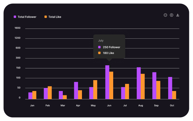
Column Chart
Display data comparisons easily with a Column Chart, highlighting differences between categories with clear, vertical bars.

Area Chart
Visualize cumulative data trends over time with an Area Chart, emphasizing magnitude and changes through shaded regions.

Bar Chart
Compare data across categories with a Bar Chart, using horizontal bars for clear visual distinctions and comparisons.
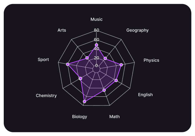
Radar Chart
Display multivariate data on a circular grid with a Radar Chart, comparing values across multiple dimensions effectively.

Funnel Chart
Visualize stages in a process with a Funnel Chart, highlighting drop-offs and conversion rates at each step.

Treemap Chart
Display hierarchical data with a Treemap Chart, using nested rectangles to compare proportions and visualize data distribution.
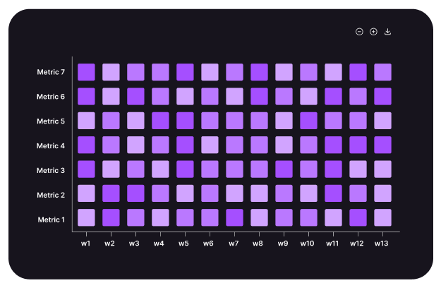
Heatmap Chart
Visualize data intensity with a Heatmap Chart, using color gradients to highlight patterns, correlations, and variations.

Boxplot Chart
Summarize data distribution with a Boxplot Chart, highlighting medians, quartiles, and outliers for effective statistical analysis.

Candlestick Chart
Visualize price movements in financial markets with a Candlestick Chart, showing open, high, low, and close values effectively.
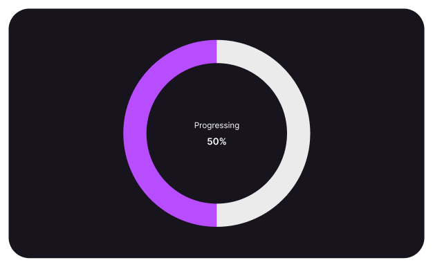
Radialbar Chart
Display data progress and performance with a Radial Bar Chart, using circular bars to illustrate completion percentages visually.
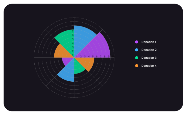
Polar Area Chart
Visualize data proportions in a circular format with a Polar Area Chart, highlighting differences through radial segments.
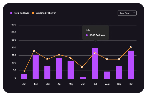
Mixed Chart
Combine multiple chart types in a Mixed Chart, offering a versatile way to compare diverse datasets in one visualization.
Line Chart
Visualize data trends and fluctuations over time with a Line Chart, offering a clear and smooth progression analysis.

Column Chart
Display data comparisons easily with a Column Chart, highlighting differences between categories with clear, vertical bars.
Area Chart
Visualize cumulative data trends over time with an Area Chart, emphasizing magnitude and changes through shaded regions.


Bar Chart
Compare data across categories with a Bar Chart, using horizontal bars for clear visual distinctions and comparisons.
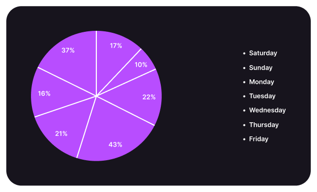
Pie Chart
Show data proportions in a Pie Chart, visually dividing a whole into slices representing percentage-based contributions.

Radar Chart
Display multivariate data on a circular grid with a Radar Chart, comparing values across multiple dimensions effectively.
Funnel Chart
Visualize stages in a process with a Funnel Chart, highlighting drop-offs and conversion rates at each step.


Treemap Chart
Display hierarchical data with a Treemap Chart, using nested rectangles to compare proportions and visualize data distribution.
Heatmap Chart
Visualize data intensity with a Heatmap Chart, using color gradients to highlight patterns, correlations, and variations.


Boxplot Chart
Summarize data distribution with a Boxplot Chart, highlighting medians, quartiles, and outliers for effective statistical analysis.
Candlestick Chart
Visualize price movements in financial markets with a Candlestick Chart, showing open, high, low, and close values effectively.


Radialbar Chart
Display data progress and performance with a Radial Bar Chart, using circular bars to illustrate completion percentages visually.
Polar Area Chart
Visualize data proportions in a circular format with a Polar Area Chart, highlighting differences
through radial segments.


Mixed Chart
Combine multiple chart types in a Mixed Chart,
offering a versatile way to compare diverse
datasets in one visualization.
How visually see different chart
Unique Chart Styles for Full Customization
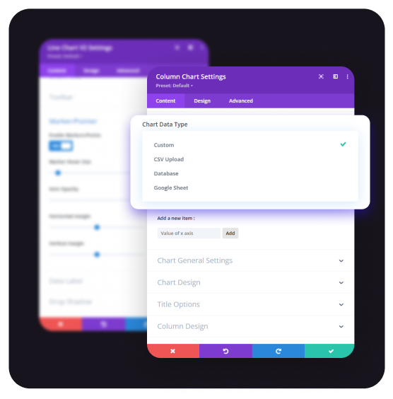
Chart Type
Using different data sources—whether custom, CSV, databases, APIs, or Google Sheets—provides flexibility in chart creation.

Custom Data Type
Custom Data Types are especially useful when you want to preprocess or manipulate data before charting, or if you’re working with complex datasets.

CSV Upload Type
Using CSV data to create charts is a common approach, especially when handling data from external sources.

Database Data Type
Using Database Data Type to create a chart involves directly retrieving data from a database (such as MySQL, PostgreSQL, etc.)
Google Sheet
Using Google Sheets as a data source for charts involves accessing data directly from a Google Sheets document via the Google Sheets API.
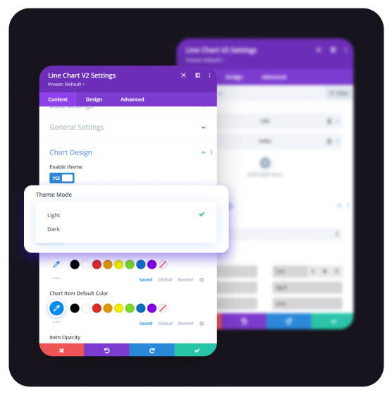
Chart Design Options
Setting up theme and background options is powerful for making charts visually distinct and enhancing data clarity.
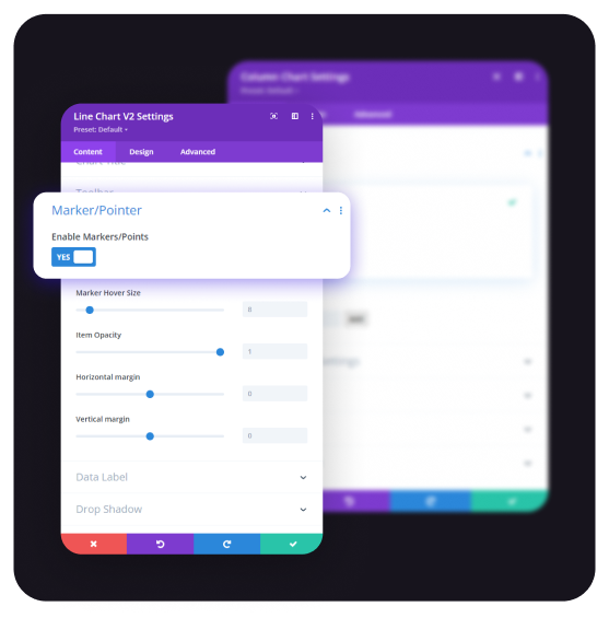
Marker Options
Marker Options in Chart define the visual representation of data points on a chart. Key settings include: Size, Colors, Shape, Hover Effects etc.
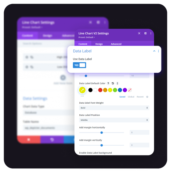
Data Label Settings
Data Label Settings control the appearance and behaviour of labels that display data values directly on the chart. Key options include: Enabled, Formatter, Style, Position etc.
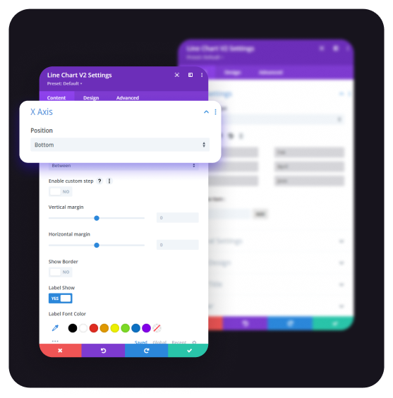
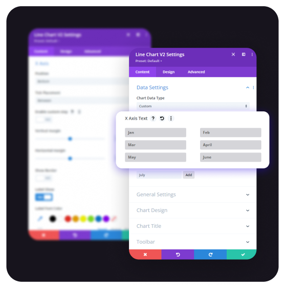
X-Axis Settings
The X-Axis in chart is crucial for defining the horizontal orientation of your chart, typically representing categories or values.
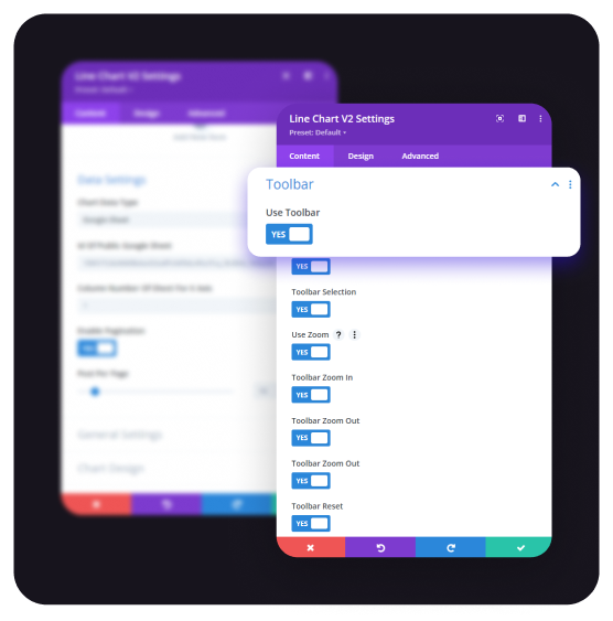
Toolbar Options
The Toolbar Option provides interactive controls that enhance user experience when viewing charts. It allows you to add features like Download, Zooming, Reset etc.

Chart Type
Using different data sources—whether custom, CSV, databases, APIs, or Google Sheets—provides flexibility in chart creation.
CSV Upload Type
Using CSV data to create charts is a common approach, especially when handling data from external sources.

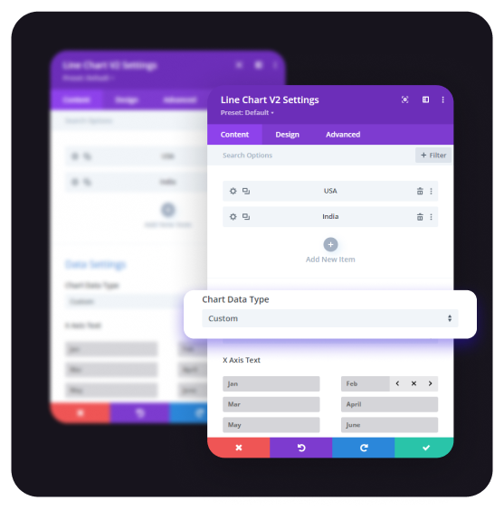
Custom Data Type
Custom Data Types are especially useful when you want to preprocess or manipulate data before charting, or if you’re working with complex datasets.
Google Sheet
Using Google Sheets as a data source for charts involves accessing data directly from a Google Sheets document via the Google Sheets API.


Database Data Type
Using Database Data Type to create a chart involves directly retrieving data from a database (such as MySQL, PostgreSQL, etc.)
Chart Design Options
Setting up theme and background options is powerful for making charts visually distinct and enhancing data clarity.


Toolbar Options
The Toolbar Option provides interactive controls that enhance user experience when viewing charts. It allows you to add features like Download, Zooming, Reset etc.
X-Axis Settings
The X-Axis in chart is crucial for defining the horizontal orientation of your chart, typically representing categories or values.


Data Label Settings
Data Label Settings control the appearance and behavior of labels that display data values directly on the chart. Key options include: Enabled, Formatter, Style, Position etc.
Marker Options
Marker Options in Chart define the visual representation of data points on a chart. Key settings include: Size, Colors, Shape, Hover Effects etc.

Divi chart kit FAQ
Divi Chart Kit is a comprehensive plugin designed to enhance the Divi Builder by enabling users to create a wide variety of interactive and customizable charts and graphs for effective data visualization on WordPress websites.
What is Divi Chart Kit?
Divi Chart Kit is a plugin that integrates with the Divi Builder, providing a suite of modules to create diverse charts and graphs, such as line, column, bar, pie, and mixed charts, facilitating dynamic data presentation on your website.
Which chart types are supported by Divi Chart Kit?
Divi Chart Kit supports various chart types, including: 19 Charts are available here.
- Line Chart
- Column Chart
- Google Chart(world)
- Google Chart(Country)
- Bar Chart
- Pie Chart
- Donut Chart
- Area Chart
- Radar Chart
- Funnel Chart
- Treemap Chart
- Heatmap Chart
- Boxplot Chart
- Candlestick Chart
- Radial Bar Chart
- Polar Area Chart
- Mixed Chart
- Scatter Chart
- Slope Chart
This extensive range allows for versatile data visualization to suit various needs.
Is Divi Chart Kit compatible with the latest version of Divi Builder?
Yes, Divi Chart Kit is designed to be fully compatible with the latest version of the Divi Builder, ensuring seamless integration and functionality.
Can I customize the appearance of the charts created with Divi Chart Kit?
Absolutely. Divi Chart Kit offers extensive customization options, allowing you to adjust colors, fonts, labels, and other styling elements to align with your website’s design aesthetics.
Does Divi Chart Kit support responsive design?
Yes, charts created with Divi Chart Kit are fully responsive, ensuring they display correctly across various devices and screen sizes.
Is there documentation available for Divi Chart Kit?
Comprehensive documentation is available to assist with installation, setup, and utilization of Divi Chart Kit, providing step-by-step guidance for users.
How can I purchase Divi Chart Kit?
Divi Chart Kit is available for purchase through the official website, offering various pricing plans to suit different user needs. Also you can purchase from divi marketplace and product name is Divi Chart Kit.
Save UP to 60% OFF


