
Charts are essential for presenting data visually. They make complex information simple and easy to understand.
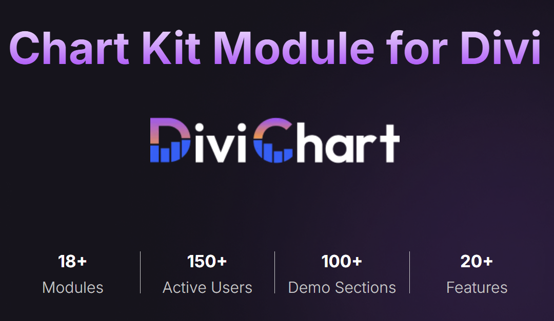
Divi Chart Kit for WordPress offers many chart types to enhance your website. Whether you need to display sales data, website traffic, or survey results, this tool has you covered. Creating charts can help engage your audience and deliver your message more clearly.
In this blog post, we will explore the top 7 chart types you can create using Divi Chart Kit for WordPress. Each chart type has unique benefits that can help you present your data effectively. Let’s dive in and discover which charts will best suit your needs.
Introduction To Divi Chart Kit
Divi Chart Kit helps you create beautiful charts on your WordPress site. It’s designed to be easy. You don’t need any coding skills. Just drag and drop. This makes it perfect for beginners.
Divi Chart Kit offers many features. It supports different chart types like bar, line, and pie. Customization options are plenty. Change colors, labels, and sizes. This makes your charts look unique. The plugin is also responsive. Charts look good on all devices. It integrates with your WordPress site smoothly. You can add charts to any page or post. Quick and simple.
First, download the plugin from the WordPress repository. Then, go to your WordPress dashboard. Click on “Plugins” and then “Add New”. Upload the plugin file and click “Install Now”. After installation, activate the plugin. You are now ready to create amazing charts.
Bar Charts
Bar charts are great for comparing different categories. They show clear differences. Bar charts are easy to read. They work well for showing changes over time. Bar charts are useful in many cases. You can use them for surveys. You can also use them for sales data. Students and teachers can use them too.
Divi Chart Kit offers many options. Change colors to match your theme. Adjust the bar width for better visuals. Add labels to make data clear. Use tooltips to give extra info. Choose horizontal or vertical bars. Customize fonts for better readability.
Line Charts
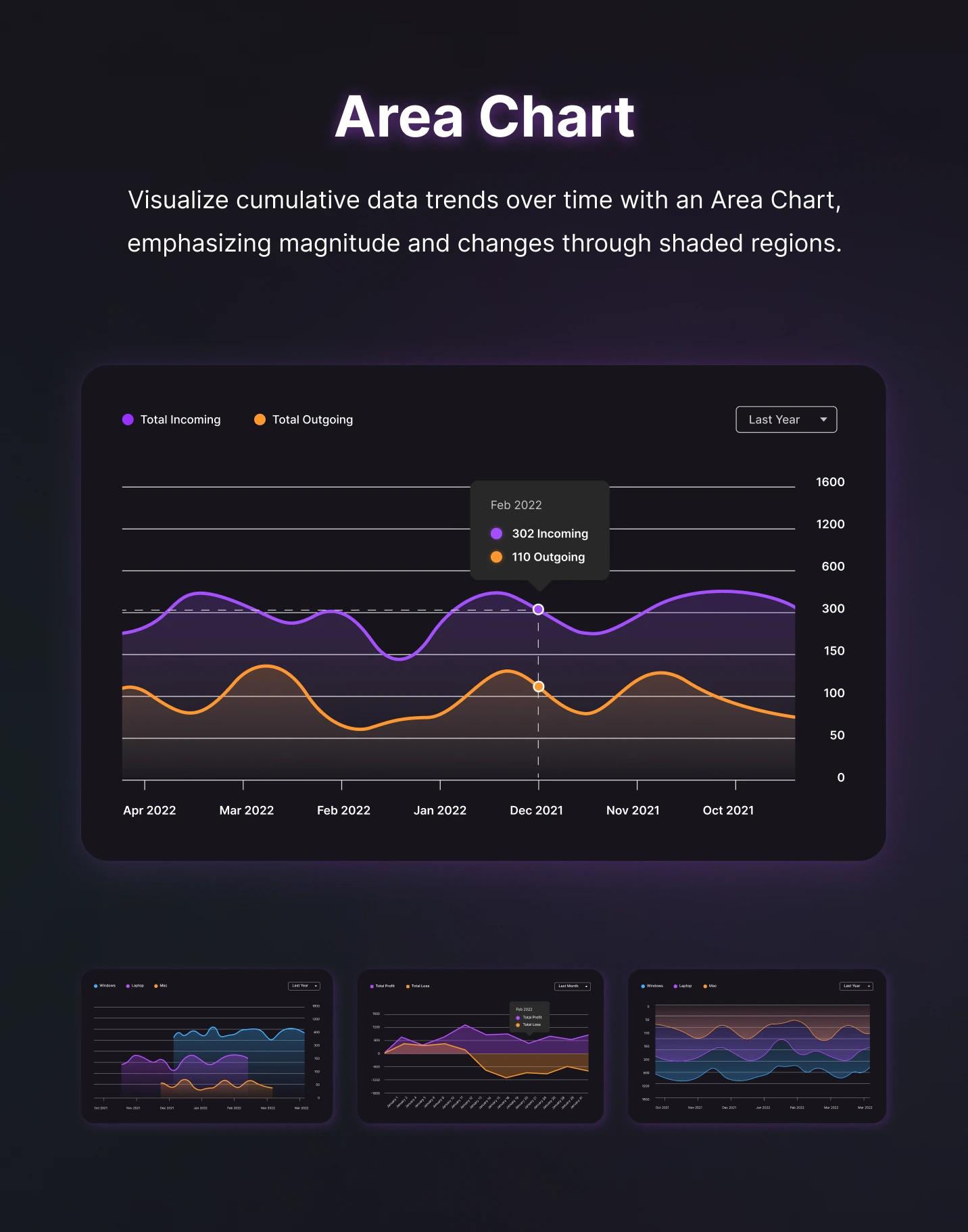
Line charts are perfect for showing trends over time. They work well with data that changes in a continuous flow. For example, monthly sales figures or yearly temperature changes. This type of chart helps to see patterns and trends easily.
Keep the background simple. This makes the lines stand out. Use different colors for each line to avoid confusion. Make sure the lines are not too thick. This keeps the chart easy to read. Add labels to the axes. This helps to understand the data quickly. Keep the chart clean and not cluttered. Less is more in this case.
Credit: www.elegantthemes.com
Pie Charts
Pie charts are great for showing parts of a whole. They are often used in business reports. For example, they can show market share of different companies. Schools use them to display student grades. They are also helpful in surveys to show preferences.
Colors in pie charts should be clear. Bright colors can make data stand out. Use different colors for each slice. This helps in making each part easy to see. Avoid using too many colors. Stick to a few contrasting colors for best results. This keeps the chart simple and easy to understand.
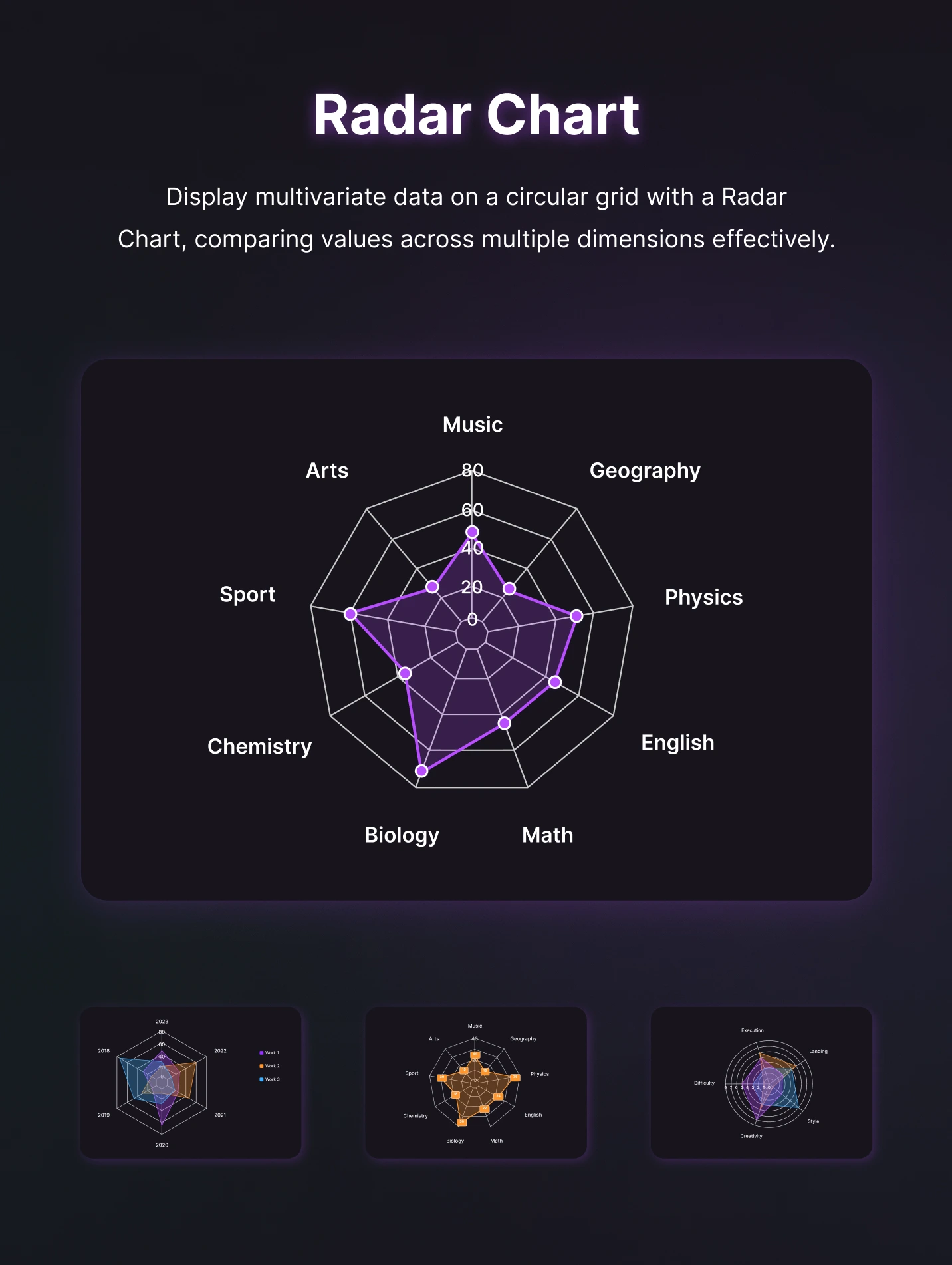
Radar Charts
Use clear labels for each axis. This helps people understand the data. Keep the number of axes limited. Too many axes can confuse readers. Choose contrasting colors. This makes each data series stand out. Use a consistent scale. This helps in comparing different data sets.
Ensure all axes start at the same point. This keeps the chart balanced. Keep axis increments equal. This makes data comparison easy. Label each axis clearly. This avoids confusion. Use grid lines sparingly. Too many lines can clutter the chart.
Credit: www.codester.com
Doughnut Charts
Doughnut charts have a hole in the center. This makes them look different from pie charts. The center space can hold labels or numbers. This helps in better data interpretation.
Doughnut charts also use colors better. Each segment stands out clearly. This makes it easier to compare data. The chart is less cluttered. Reading it is simple and quick.
Formatting techniques can be applied to enhance the visual appeal. Use contrasting colors. Add clear labels. Make sure each segment is distinct. This ensures your chart is easy to understand.
Polar Area Charts
Polar Area Charts are perfect for displaying data in a circular manner. They help in comparing different categories. You can use them in many fields. For example, show seasonal changes in weather. Or compare sales across different regions. They are also useful in representing survey results. Each segment stands out clearly.
Keep your Polar Area Charts simple and clean. Use contrasting colors for each segment. This makes it easy to understand. You can add labels for clarity. Try different layouts. Some people like a more radial design. Others prefer a more segmented look. Experiment to see what works best. Always aim for readability and accuracy.
Credit: www.elegantthemes.com
Bubble Charts
Bubble charts are perfect for showing data with three dimensions. Each bubble’s size shows a different value, making it easy to compare. For example, you can use them to show sales, profit, and market share together. This helps in understanding complex data quickly.
Adding colors to bubbles can make the chart more readable. You can use different colors for different categories. This helps in visualizing data better. Labels are also important. They give more information about each bubble. A legend can explain what each color and size means. This makes the chart user-friendly.
Frequently Asked Questions
What Chart Types Can Divi Chart Kit Create?
Divi Chart Kit can create various chart types including bar charts, pie charts, line charts, radar charts, doughnut charts, and polar area charts. These charts help in visually representing data efficiently on your WordPress website.
How To Add A Bar Chart Using Divi Chart Kit?
To add a bar chart, select the bar chart option in Divi Chart Kit. Customize the data points and design as needed. This tool offers easy integration and customization for an engaging user experience.
Is Divi Chart Kit Beginner-friendly?
Yes, Divi Chart Kit is beginner-friendly. It offers an intuitive interface with drag-and-drop features. Even beginners can create professional-looking charts without any coding knowledge.
Can Divi Chart Kit Create Responsive Charts?
Yes, Divi Chart Kit creates responsive charts. These charts automatically adjust to different screen sizes and devices. This ensures a seamless user experience across all platforms.
Creating charts with Divi Chart Kit is simple and effective. The tool offers diverse options for any data need. Your website becomes more engaging and informative. Visuals make complex information easy to understand. Start using Divi Chart Kit today. Enhance your content with powerful charts.
Your audience will appreciate the clarity and professionalism. Make your data stand out effortlessly.